Weighing trees

I went to Mat Disney’s inaugural lecture at UCL last Tuesday. Mat was (is?) the course coordinator for the Masters in Remote Sensing at UCL, and was reflecting over his career, how he got to where he is and what the future might hold. I really enjoyed it, as there’s often a veil of mystery over senior academics. I’ll summarise the core points as they’re definitely of interest to wider audiences!

Trees are great

The view from the bottom of the tallest tropical tree in the world

Taken from Mat’s blog

One of the first ports of call was just a general discussion around trees. Their great diversity is worth celebrating, from the tall (up to 120m!) redwoods of west coast of the US to stumpy flat trees on the sides of windswept valleys, our scientific understanding of trees may be (and we will find out later, is) limited, but appreciating them as an amazing organism is worth doing in the first instance.

But trees are hard to weigh

Carbon estimates for trees are a crucial input to models driving climate change predictions, and Mat succinctly summarised the major gaps in knowledge associated with them. Firstly, to get a real measurement of the amount of carbon stored in a tree, you have no choice but to chop it down and weigh it. It’s a huge and grueling effort to do, so it’s no wonder that only 4,000 or so trees had been felled in tropical forests in 2015 – the extrapolation of which gives our estimates for the amount of carbon in tropical forests. Obviously, this has a huge implication for accuracy within these models, as the sample size and diversity of the sample is miniscule when scaled globally. Even in the UK, where you would expect the measurements to be more refined than the harsh environments of the tropics, we found out that carbon estimates in the UK are based upon a sample of 60 or so trees from a paper written in the late 60s, and a simple linear relationship used to extrapolate to he whole of the UK! in data science, we make lots of assumptions, but this is up there as a massive howler. So how can we hope to get more ground truth?

Lasers can weigh them

Image from Mat’s blog

Enter our hero, the reigl laser scanner, which has gone on tours of tropical forests across the globe, taking 3D images of trees to artificially weigh them where they stand. Mat has used these 3D images to redefine the principals of allometry – the science of relative size of measurements (such as brain size vs weight) – when it comes to trees. He reveals that allometric relationships underestimate carbon in tropical forests by as much as 20 %! In the UK, he revisited the 60 or odd samples off which all UK forestry estimates are based, and showed that these estimates are as far off as 120 %! These are really incredible figures that show how far wrong we’ve been going so far.

From space?

The GEDI (recently launched LiDAR) and BIOMASS (PolInSAR) missions are hoping to make the modelling of these ground truth data being recorded by the like’s of Mat to satellite data much tighter, which will hopefully vastly increase our ability to estimate carbon stores in tropical forestry. This, combined with the clear communication of Mat’s methods and the distinct gap in knowledge, make it very important and interesting research!

Lastly, I’d like to give a big congratulations to Mat on the chair, it was well earned!

Earth from space

The BBC have released the first of a documentary series focusing on Remote Sensing, and how it has changed/can teach us about out changing planet. It’s definitely a tough subject to fill whole episodes with, so the style is somewhat blended between satellite imagery, and storytelling on the ground, which makes for a very different kind of wildlife documentary experience.

I’m particularly curious as to how they produced the ‘superzooms’, which involve both zooming into, and out from, individual elephants in Africa to a continent wide view, as  they’re extremely well done. I’m a bit skeptical as to how much space cameras are involved in videoing shaolin monks, and am curious which satellites would even have the capability for this – maybe Vivid-i could capture a short video sequence, but the resolution wouldn’t really be high enough to discern individuals, and the recently defunct Worldview-4 would only be able to capture stills. Regardless, it’s really a well paced, emotional episode which I enjoyed immensely.

worldview.jpg

Sample from Worldview-4, available here

The series continues next week with an episode on patterns – the dunes of Namibia are an area whose beauty I only really discovered through sentinel_bot and I’m looking forward to learning more!


Scene from above

I’ve been severely neglecting my blog on account of focusing on writing up my PhD project as well as being sick (don’t underestimate the pain of getting your tonsils out as an adult!).

I wanted to write up a decent post for my 100th entry, but have subsequently realised it’s lead to me posting nothing for the last couple of months! I have a plan for a good entry coming up, though will need to find the time to put it together.

In the meantime, I picked up that Alistair Graham (geoger), who gave a talk at the conference I ran this year, and Andrew Cutts, who I have never met, though I remember worked through the straightforward openCV GUI demo from his website which I thought was great, have started a podcast, scene from above.

Science communication is tricky at the best of times, so I’m excited they’re giving this style of delivery a crack. The demo episode discusses Sentinel 5p and the larger scope of the sentinel project, remap’s webapp and cloud computing more generally, and the launch of a Moroccan satellite.

I think the discussion of the webapp was my favorite part. I appreciated Alistair’s humility in admitting that maybe he was approaching interaction with data from a point of view that was somewhat outdated, as he seems (as am I!) skeptical of the benefits of a sleek interface. Admittedly the app isn’t designed with me or others in the RS community in mind, but I can’t see it being used much in it’s current iteration.

Thinking of my ornithologist friends currently in PhDs/postdocs who would be the target audience for an app like this, they would almost definitely look at it for an hour or two with interest, and never think to use it again. Having consistently tried to get them interested in RS and accurate mapping, the tools need to be unbelievably simple to get people to consider using them seeing as so much of other scientists time is dedicated to learning specialist knowledge and general computing skills. It’s one of the many challenges of interdisciplinary work in science!

I’m looking forward to the next episode of the podcast, and hope a forum opens up for discussion online as I think I’d have something to contribute, and would love to hear other people’s opinions on these ideas!

Keep an eye out for a longer update soon 🙂

Django greyscales

Access the application here.

I’ve been learning lots about the django web framework recently as I was hoping to take some of the ideas developed in my PhD and make them into public applications that people can apply to their research. One example of something which could be easily distributed as a web application is the code which serves to generate greyscale image blocks from RGB colour images, a theme touched on in my poster at EGU 2016.

Moving from a suggested improvement (as per the poster) using a complicated non-linear transformation to actually applying it to the general SfM workflow is no mean feat. For this contribution I’ve decided to utilise django along with the methods I use (all written in python, the base language of the framework) to make a minimum working example on a public web server (heroku) which takes an RGB image as a user input and returns the same image with a number of greyscaling algorithms (many discussed in Verhoeven, 2015) as an output. These processed files could then be redownloaded and used in a bundle adjustment to test differences of each greyscale image set. While not set up to do bulk processing, the functionality can easily be extended.

web_out

Landing page of the application, not a lot to look at I’ll admit 😉

To make things more intelligible, I’ve uploaded the application to github so people can see it’s inner workings, and potentially clean up any mistakes which might be present within the code. Many of the base methods were collated by Verhoeven in a Matlab script, which I spent some time translating to the equivalent python code. These methods are seen in the support script im_proc.py.

Many of these aim to maximize the objective information within one channel, and are quite similar in design so it can be quite a difficult game of spot the difference. Also, the scale can often get inverted, which shouldn’t really matter to photogrammetric algorithms processes, but does give an interesting effect. Lastly, the second PC gives some really interesting results, and I’ve spent lots of time poring over them. I’ve certainly learned a lot about PCA over the course of the last few years.

web_out.png

Sample result set from the application

You can access the web version here. All photos are resized so they’re <1,000 pixels in the longest dimension, though this can easily be modified, and the results are served up in a grid as per the screengrab. Photos are deleted after upload. There’s pretty much no styling applied, but it’s functional at least! If it crashes I blame the server.

The result is a cheap and cheerful web application which will hopefully introduce people to the visual differences present within greyscaling algorithms if they are investigating image pre-processing. I’ll be looking to make more simple web applications to support current research I’m working on in the near future, as I think public engagement is a key feature which has been lacking from my PhD thus far.

I’ll include a few more examples below for the curious.


This slideshow requires JavaScript.

Sentinel bot source

I’ve been sick the last few days, which hasn’t helped in staying focused so I decided to do a few menial tasks, such as cleaning up my references, and some a little bit more involved but not really that demanding, such as adding documentation to the twitter bot I wrote.

While it’s still a bit messy, I think it’s due time I started putting up some code online, particularly because I love doing it so much. When you code for yourself, however, you don’t have to face the wrath of the computer scientists telling you what you’re doing wrong! It’s actually similar in feeling to editing writing, the more you do it the better you get.

As such, I’ve been using Pycharm lately which has forced me to start using PEP8 styling and I have to say it’s been a blessing. There are so many more reasons than I ever thought for using a very high level IDE and I’ll never go back to hacky notepad++ scripts, love it as I may.

In any case, I hope to have some time someday to add functionality – for example have people tweet coordinates + a date @sentinel_bot and have it respond with a decent image close to the request. This kind of very basic engagement for people who mightn’t be bothered going to Earth Explorer or are dissatisfied with Google Earth’s mosaicing or lack of coverage over a certain time period.

The Sentinel missions offer a great deal of opportunity for scientists in the future, and I’ll be trying my best to think of more ways to engage the community as a result.

Find the source code here, please be gentle, it was for fun 🙂

dainlptxkaajaaw

Photogrammetry rules of thumb

I’ve uploaded a CloudCompare file of some fieldwork I did last year to my website here. It uses the UK national LiDAR inventory data, mentioned in the post here. I think it espouses lots of the fundamentals discussed here, and is a good starting point for thinking about network design.

80% overlap

This dates way back, and I’m unsure of where I heard it first, but 80% overlap between images in a photogrammetric block with a nadir viewing geometry is an old rule of thumb from aerial imaging (here’s a quick example I found from 1955), and carries through to SfM surveying. I think it should likely be a first port of call for amateurs doing surveys of surfaces, as it’s very easy to jot down an estimate before undertaking a survey. For this, we should consider just camera positions orthogonal to the surface normal (see this post) and estimate a ground sample distance to aid us with camera spacing from there.

1:1000 rule

This has become superseded in recent years, but is still a decent rule of thumb for beginners in photogrammetry. It says that, in general (very general!), the surface precision of a photogrammetric block will be around 1/1000th of the distance to the surface. Thus, if we are imaging a cliff face from 30m away, we can realistically expect accuracy to within 3 cm of that cliff. This is very useful, especially if you know beforehand the required accuracy of the survey. This is also a more stable starting point than GSD, whose quality as a metric which can vary widely depending on your camera selection.

Convergent viewing geometry

Multi-angular data is intuitively desirable to gather, with the additional data comes additional data processing considerations, but recently published literature has suggested that adding these views has the secondary effect of mitigating systematic errors within photogrammetric bundles. Thus, when imaging a surface, try and add cameras at off angles from the surface normal in order to build a ‘strong’ imaging network, to avoid systematic error creeping in.

Shoot in RAW where possible

Whilst maybe unnecessary for many applications, RAW images allow the user to capture a much great range of colour within an image, owing to the fact that colours are written on 12/14 bits rather than the 8 of JPG images. Adding to this, jpg compression can impact the quality of the 3D point clouds, so using uncompressed images is advised.

Mind your motion

Whilst SfM suggests that the camera is moving, we need to bear in mind that moving cameras are subject to blur, and this is sometimes difficult to detect, especially when shooting in tough conditions where you can’t afford to look at previews. Thus, you can pre-calculate a reasonable top speed for the camera to be moving, and stick to that. We recommend a maximum of 1.5 pixels in GSD over the course of each exposure given the literature and as advised by the OS.

Don’t overparameterize the lens model

Very recently, studies have suggested that overparameterizing the lens model, particularly when poorer quality equipment is being used without good ground control, can lead to a completely unsuitable lens model being fit which will impact the quality of results. The advice – only fit f, cx, cy, k1 and k2 parameters if you’re unsure of what you’re doing. This is far from the default settings in most software packages!

Conclusion

I had a few more points in my long list, but for now these 6 will suffice. Whilst I held back on camera selection here you can read my previous camera selection post for some insight into what you should be looking for. Hope this helps!

EO Detective interviews Tim Peake

I saw this on EODetective‘s twitter account – an interview with Tim Peake about the process behind the astronaut’s photography generated on board the ISS. I’ve actually used a strip of them before to make a photogrammetric model of Italy, and was very curious about the process behind their capture.

Interesting to see they use unmodified Nikon D4s – I was curious about why they were using a relatively small aperture (f/11) for the capture of the images I had downloaded, and while ISO was mentioned I’m still left wondering. I guess they don’t really think about it as they are very busy throughout the day, though he did mention they leave them in fully automatic most of the time. While you could potentially get better quality images from setting a wider aperture, as per DxoMark’s testing on 24 mm lenses, I’m guessing the convenience of using fully-auto settings outweigh the cost.

But that’s not really in the spirit of the interview, which is more to get a general sense of life aboard the ISS.

normed.jpg

A sample image from the ISS

Reflecting on Wavelength

Two years ago I agreed to join the committee of a professional body known as the Remote Sensing and Photogrammetry Society (RSPSoc), a professional body whose remit is to promote and educate its members and the public on advancements in Remote Sensing Science. When I signed up to join as the Wavelength representative, I admittedly knew very little about not only how this society operated, but societies in general, and what their function was in the greater scope of progress of Science. I took on the role knowing I’d have to learn fast, and, after a two year lead period, host a conference focusing on Remote Sensing and Photogrammetry, which would serve to bring early career researchers from both academia and industry together to discuss the latest advancements in RSP Science.

The first Wavelength conference I attended way back in 2015 was at Newcastle, a few months after my first conference experience at the 2014 GRSG meeting in London, just two months after starting my project.

The difference was apparent, with the GRSG attracting the old guard from all over the world to contribute to the conference. I distinctly remember Nigel Press, a veteran Remote Sensor and founder of NPA satellite mapping, turning around to the crowd during a Q and A session pleading with people to start taking risks funding/supporting hyperspectral satellite missions, as their contributions to geological research was so apparent. I didn’t mention it in my write up from that conference, but it really stuck with me as, at least for that minute, it all seemed so human. But apart from that, it was all quite formal and difficult to tell how I, as a novice, could really play a part.

With Wavelength, however, this humanity is what it’s all about! When everyone’s a novice, you can afford to be a bit more gung-ho with your opinions. As someone who tries to always ask, or at least dream up, a question during Q and A portions of talks, I loved it so much. Rich bluesky discussions have kept me motivated around the inevitable slower portions of writing and finicky data processing of my project, and Wavelength had them in buckets! The fact that I got so much out of it was part of my reason for volunteering to host it, as I felt like it would be a way for me to contribute back to the community, and get more involved in RSPSoc.

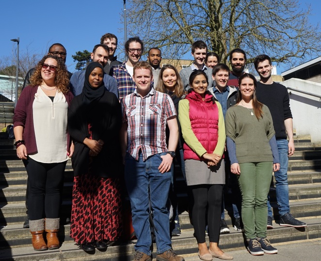
After an extremely enjoyable and well-run conference at MSSL during the spring of 2016, it was up to me to deliver a conference in Kingston in March 2017, while coordinating the final run in to my PhD project. While things could definitely have been done better, and I should have maybe been a bit more ruthless about advertising the conference to a wider audience, I have to say I think it ran quite smoothly, and the delegates got a lot out of it, as did I! I’ll include a summary of each day below, and my favourite parts throughout the three day agenda, including a longer description of one delegate presentation.

Monday 13th March

Delegates arrived at Kingston train station at around 11.30 am. I had enlisted the help of my colleague Paddy to go and meet the delegates, as I had to run up the poster boards to the conference room. After lunch and a quick roll call, things kicked off with 6 talks spanning image processing and Remote Sensing of vegetation.

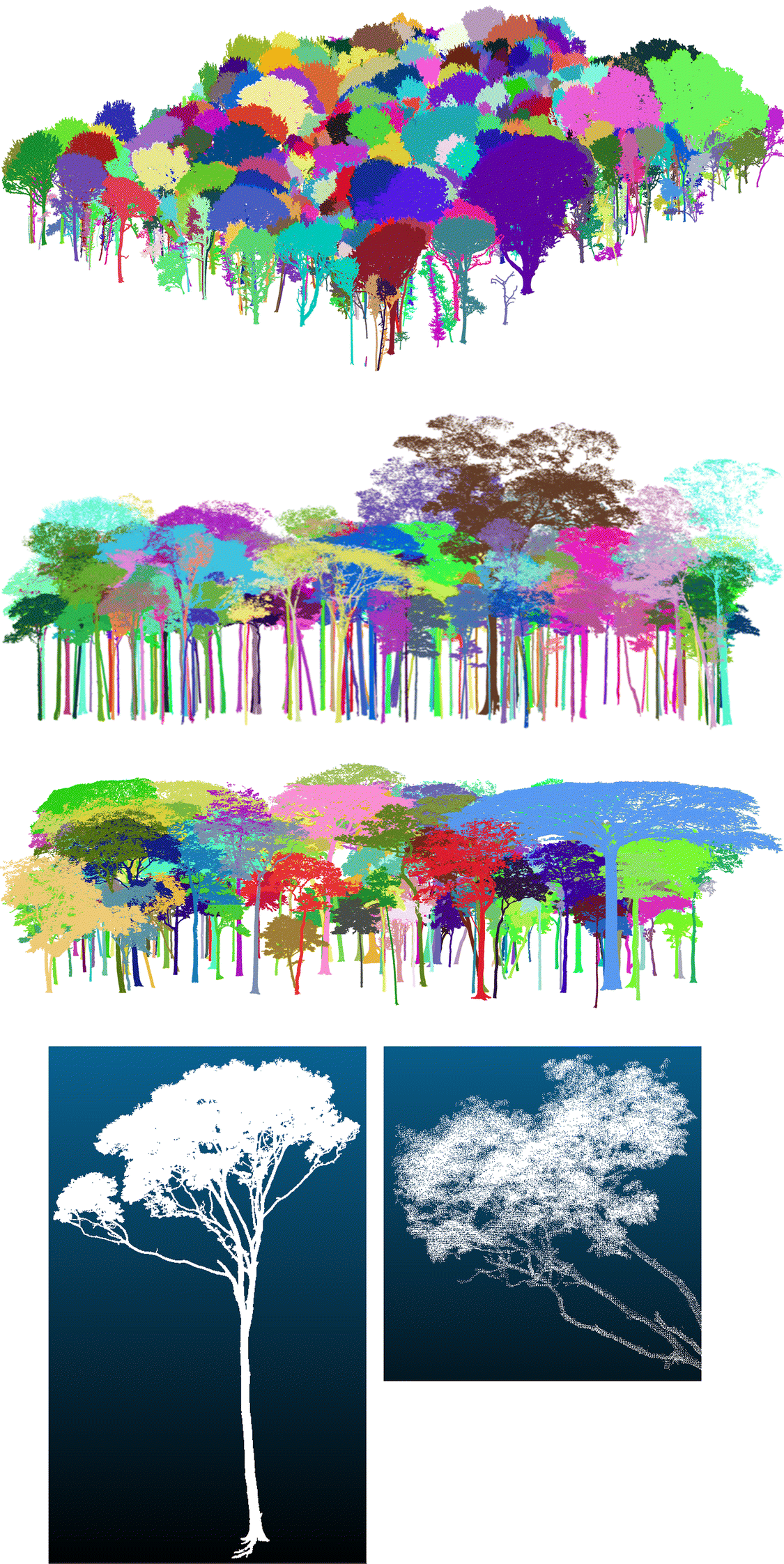
Andrew Cunliffe, eventual winner of best speaker, showed some captivating UAV footage of Qikiqtaruk, a site where arctic ecology is being furtively researched to try to gain insight into differences between observations at different scales, both the changing ecological and geomorphological landscapes. I was interested in his hesitance in saying what he was doing for UAVs was not ‘ground truthing’ of satellite images, but more ‘evaluation’ thereof, as ground truth was never really acquired (outside of GCPs for a few of the 3D models). You can check out his profile on google scholar, which lists some pretty interesting research!

Monday wrapped up with a meal at a local Thai food restaurant, the Cocoanut, a staple with the Kingston Research folk!

Tuesday 14th March

After a tour of Kingston’s town centre in the morning, we returned to the conference venue to listen to Alastair Graham, of geoger fame, give an insightful and extremely helpful talk about career options for Remote Sensing scientists. I felt really lucky to have had the opportunity to host him – truth be told it was a bit of a fluke we crossed paths at all! He had been retweeting some of the tweets from the @sentinel_bot twitter account I had made, which caused me to look at his twitter and subsequently his website. Realising he was organising an RS meeting in Oxford the month before Wavelength (Rasters Revealed), I jumped at the chance to get him onboard, and I’m glad I did! I won’t go into his use of sli.do, but only mention that it’s worth looking into.

On Tuesday, James Brennan’s talk about the next generation of MODIS burnt area products brought me back to my Masters’ days at UCL, and my time spent with the JRCTIP products. James’ talk was focused on the binary nature of classification, and how he was looking into using a DCT to model behaviours of fires, something like a fuzzy land classification. It was really engaging and I enjoyed his super-relaxed style of presenting.

DSC00004.JPG

Delegates eye up some posters

Tom Huntley of Geoxphere also came in to give us a talk on recent advancements with their spinout hardware company, which provides high quality cameras for mapping purposes: the XCam series. Wavelength tries to bridge the gap between industry and acamemia, and both Tom and Alastair’s talk brought in the industry element I was hoping for.

After a nice meal at Strada Kingston, we hit the bowling alley before wrapping up day 2.

Wednesday 15th March

Wednesday’s session opened with delegates talking about mainly data processing. Ed Williamson, from the Centre for Environmental Data Analysis (CEDA) gave a very interesting introduction into the supercomputing facilities they provide (JASMIN), as well as services offered to clients choosing to avail of these services. They host the entire Sentinel catalogue, which is such an outrageous amount of data, and so it was interesting to be given a whirlwind tour of how this is even possible, practically speaking.

We also had the pleasure of listening to José Gómez-Dans from NCEO talk to us about integrating multiple data sources into a consistent estimation of land surface parameters using advanced data assimilation techniques. I had done my Masters’ thesis with Jóse, and (somewhat) fondly remember trying to interpret charts where the error bars couldn’t even be plotted in any reasonable way on them. This is the reality of EO though, uncertainty is part and parcel of it!

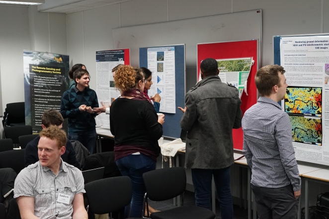
The poster session featured a wide range of topics, I even put up my one from EGU last year, and participants were extremely interested in drought mapping in Uganda, as well as numerous uses for InSAR data presented. Congrats to Christine Bischoff for winning the best poster award with her investigations of ground deformation in London.

Proceedings wrapped up with deciding on the next incoming Wavlength host (congrats to Luigi Parente, of Loughborough Uni) and a lovely lunch in the sun.

DSC00021_crop.jpg

Sunny group shot

Summary

Wavelength was really fun and interesting to organise, and I hope it’s a tradition we can keep going as a society. I’ve made the conference booklet publicly available here. For those of you who might be reading this blog and aren’t members I suggest you join, the benefits are evident.

For now, for me, it’s EGU and beyond – I’m also aiming to attend the annual RSPSoc conference in Imperial in September with latest developments from my fieldwork data!

Data visualisation

Haven’t posted in the last while, so thought I’d make a quick post about some of my favorite data visualizations I’ve come across lately. The more I read about these the more it makes me want to improve the own graphics I produce, so if you’re looking for inspiration look no further! In no particular order:

Markov Chains

Basic as the visuals are, it really gives a good feel for what finite state problems look like. Can modify with your own code too!

Markov Chains

Baye’s rule/Conditional probability

From the same blog. Bayesian stats can be a bit daunting. Let this visualization of balls dropping through a filter calm you down as you need. Interactive to boot!

Conditional Probabilty

Fourier analysis

Just beautiful graphics putting simply what so many hours of reading couldn’t. Probably my favorite in the list due to the depth it covers!

Fourier analysis

Pathfinding

Not something I’m overly familiar with but have bookmarked because of how nice the graphics are to look at. Search is such a basic concept which is such a necessity to modern computing, I love the simplicity with which it’s presented.

Pathfinding

Blend4web curiosity app

Some might call it gimmicky, but I think the ability to be able to scroll through the cameras while the robot moves is just such a cool feature.

Curiosity

Potree

I can’t believe this is freeware. It’s amongst the best tools on the internet for point cloud viewing and the design is brilliant!

Potree

Seaborn

From the DIY category – seaborn is a front end plotting library for making graphs in python. It produces some beautifully crafted graphics! I love the joint plots.

Seaborn joint plot

Bokeh

Actually a pretty standard library it seems, I can’t believe how long it took me to find. I’m preparing some interactive graphics for upcoming conferences and bokeh makes it so simple to do! I particularly like the Lorenz example!

Bokeh Lorenz

Stamen mapping skins

Some very attractive base layers for using in your mapping needs. I think I’ll have to give making a base layer a go at some stage, but for now I can appreciate the possibilities…

Stamen

100,000 stars

Last on our list, one from the astronomers. An in browser interactive environment for exploring our stellar neighborhood!

100,000 stars